Project: RayT - Mobile & Web App
End to end mobile App and admin panel
The project was to design a trucking application in which users would be able to search for carriers to deliver shipments such as furniture and other heavy equipment from shipper to receiver.
The Opportunity
How might we give customers control of there shipping needs?
The Solution
I had designed an App and Website where customers could bid on shipping loads they posted to carrier companies. I had also designed a few features that would compliment the experience.
Research and Findings
I conducted thorough research using a survey platform and had asked 30 users what they thought about current carrier companies and how might there experience improve. Below are some common responses from all users.
~ Most users wanted multiple carriers to select from before selecting a main carrier
~ Users did not want to waste time researching which carrier offered the best solutions
~ Users wanted to cut down on costs that were above average in there area
~ Users wanted to track shipment in real time
Feature Implementation
Based on the feedback I had come up with a few ideas to create high fidelity designs which included geo location, shipment tracking, costs analysis, and bidding feed.
Design Feedback
In order to get proof of concept that the designs were something users would deem useful I would test the prototype. I asked a few of my colleagues to look at the prototype to see what they thought.
The Positives
“I like the idea of being able to choose my carrier right away from the tip of my fingers”
“I'm glad I can track my shipment load and contact the carrier in transit”
The Concerns
“The bidding concept feels overwhelming at first glance and may dissuade users”
“The buttons for accept and bid are far apart.
After understanding the concerns I continued to work on the UI and designed a frame where users could see and accept bids from carriers in a less confusing and more straight forward way.
Results
“This time around it was not difficult to see what pricing was associated with carriers based on the shipment load I had submitted”
“I would recommend this app to everyone looking to anyone”
RAYT User Flow:
Landing Frame
Users will be able to select if they are a Shipper or a Carrier.
Shipper Registration
Shippers will be able to enter company name, title, phone number, and email.
Carrier Registration
Carriers will be able to enter name, DOT Number, Select dispatch, owner or operator, phone, and email address. Users will be notified when Admin accepts users onto the platform.
Profile Account
Users will be able to view a profile that has options such as bank info, post load, ratings, and being able to log out. Users will be able to edit profile username and photo.
Banking Services
Users will be able to select their bank account and be able to login to access funding and to pay for carrier services.
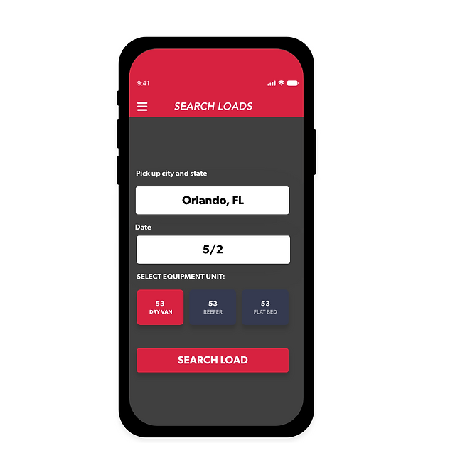
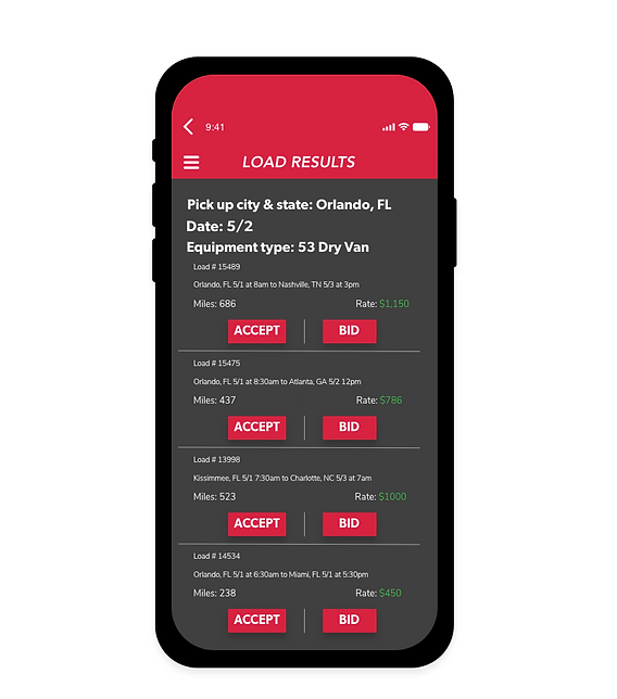
Post Load
Users will be able to input pickup location, date, time, delivery location, equipment needed, miles to destination, and special notes. Users will be able to view load details once submitted including load number and rate charge for service. Shippers will also be able to search for load requests and check the status to see if any carrier had bid on set load.
Bidding System
Shippers will be able to view multiple bids on the load they have posted. Shippers will be able to choose a carrier at their discretion. Shippers will be able to view Their load info and prices between carriers.
Ratings System
Shippers will be able to rate carriers based on how well they performed (1–5 stars and be able to write a review. Reviews will be uploaded to the Admin dashboard under reviews.
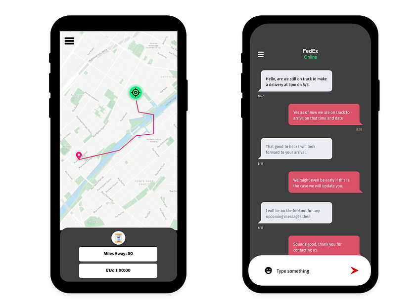
Geo Location Services and Mapping Feature
When logging into the app users will turn on location services. Shippers will be able to track the carrier in real time on the way to the specified location.
Media Upload
Shippers will be able to upload billing information to the carriers for services requested. Shippers will be able to send billing info via email.
In App Messaging
Shippers will be able to message Carrier about any questions about their order once the order has been placed. Users will be able to navigate to messaging. Users will be able to see if Carrier is online and able to chat.
Shipment History
Users will be able to see completed shipment orders that have been fully processed.
Account Settings
Users will be able to navigate to the legal, help and log out section of the app.
Project: Link - Mobile & Web App
The goal of the project was to create a mobile application and an Admin panel to an experience similar to Uber. One of the major differences In the app was that unlike Uber, this app was to be built from scratch meaning that once the app is launched the company would have to build user traction in order to gain popularity. This was a major concern for the client.
The Challenge
How might we grow user traction for a startup app?
“We are trying to incentivize users to recommend and use the app”
The Solution
I had designed an app in which users would feel encouraged to refer other users to the platform. The more referrals on the platform, the greater the user traction would be. In order to create this solution I would need to go through a few hoops in design and team feedback.
Initial Thought Process
Based on the criteria of the project I understood that the client had a budget allocated for the purpose of gaining user traction. After receiving the green light to design I thought of the idea to create a referral system where users would be paid out on the backend. The client would also be able to use funds the company made in order to maintain this promise to users.
Design and Testing
After designing the first round of High Fidelity Wireframes of both the customer and driver side of the app, I would then prototype and share the link with colleagues to see if these designs were something that users would interact with. The result didn’t hit the intended mark at first.
User stories created based on feedback from colleagues:
1. Users want to track how much income they will receive
2. Users want to know how much income they will receive per referral
3. Users want to know how many referrals they attempted versus what
4. A number of users were successfully referred to the platform
Back to iterative design based on feedback
Positive Feedback
Once the design was completed and the prototype was rewired, I would tested with my colleagues again. This time everyone who I had tested the designs with were satisfied and felt they would want to share the platform with others.
Connect App User Flow: Driver & Passenger
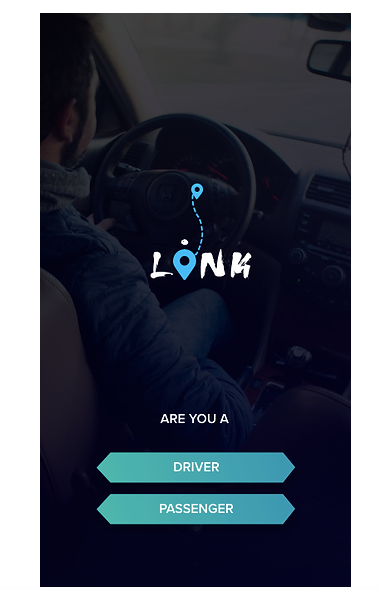
Landing Frame- Users will be able to select if they are a passenger or Driver
User Authentication
- Users will be able to sign up using name, email, and password. Users will be able to login using email and password.
- Users will also be able to login using social media plugins such as Facebook.
Driver On-boarding
- Users will need to enter the car type, mode, year, color, any damages.
- Drivers must upload the front and back of the TLC license.
- Drivers must upload Insurance card and any additional documentation
Profile Build and Customization
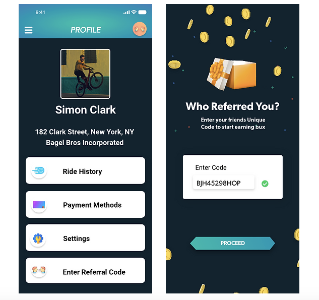
- Both users will be able to view and edit their profile. Passengers will be able to view ride history, payment methods, settings and referral code.
Dashboard
- Drivers will be able to view price per mile, ride history, referral history, total bucks, calculator, and drive requests after being confirmed onto the platform via Admin.
Price Per Mile
- Users will be able to view price per mile analytics based on where they are geographically located.
Ride History
- Both users will be able to view history or rides which include name of passenger, ride pick up and destination, and price.
Wallet System and Payment Processing
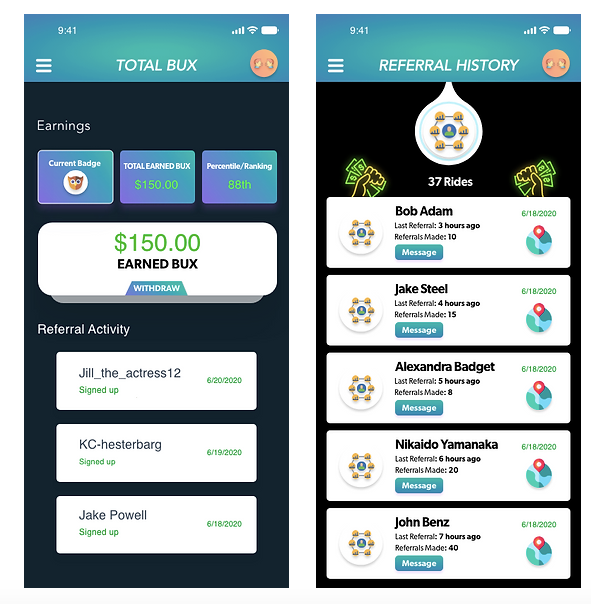
- Passengers will be able to transfer funds from their bank account into the wallet in the app using a bank transfer API. Users will be able to withdraw funds back into a bank account or pay for driver services. Passengers will also be able to view rewarded funds, ranking, badge type, and referral activity.
- Drivers will be able to view monetary funds transferred into their wallet from Passenger and be able to transfer funds into their account.
Drive Requests
- Drivers will be able to view requests from users to bring them from pick up location to drop off location. - - Drivers will be able to view the amount, name of user and be able to preview the destination for travel. - - Drivers will also be able to view featured passenger requests.
Geo Location Services and Mapping Feature
- Users will be able to send requests to drivers for pick up which includes pick up and drop off location.
- Users will be able to preview and pay for services.
- Passengers will receive an In App and Push notification when the Driver accepts their request to pick up Passengers.
- Passengers will be able to view the Driver profile and view how far away the driver is to the Passenger.
- Driver will be able to view mapping coordinates to Passenger for pick up and drop off and view ETA to Passenger.
Payment Processing
- Drivers will be able to view monetary funds transferred into their wallet from Passenger and be able to transfer funds into their account.
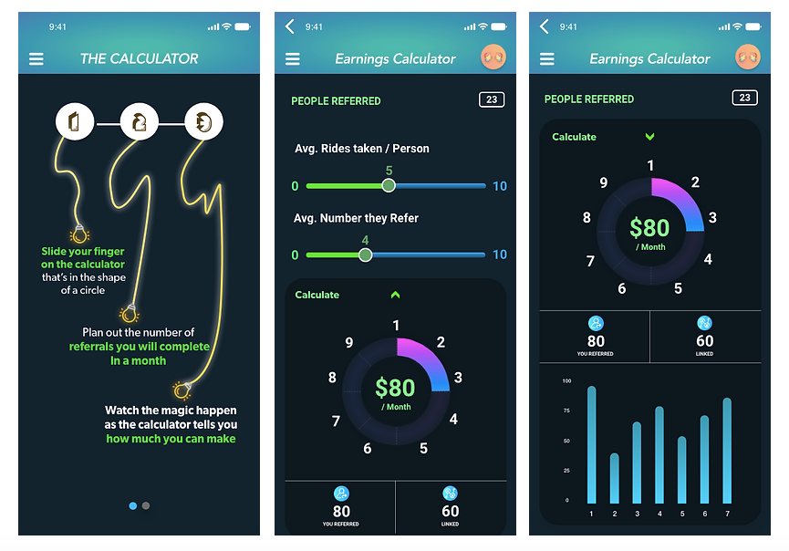
Calculator
- Passengers will be able to calculate how much income they will be able to receive in a given month per referral using the interactive sliding mechanism.
- Passengers will be able to view how many users have successfully been referred compared to all users requested.
Referral System
- Passengers will be able to navigate to referral history to view which users have been referred onto the platform and how much funding they have received upon referral.
- Passengers will be able to view the date of referral and how many referrals other users have made.
- Passengers will be able to view how long ago referral was completed
- Passengers will be able to enter in a referral code in order to process referral.
- Passengers will be able to share media with friends and family via SMS messaging and social media plugins.
In App Messaging
- Both users will be able to message other user throughout the app
Badge System
- Users will be able to earn badges based on in app interactions
Account Settings
- Bother users will be able to edit name, username, password, notifications, and location, and profile picture changes upon Admin approval.
📱 UX Case Study: "Simply Me" – An eCommerce App for Everyday Shoppers
Simply Me is your everyday digital marketplace — a simple, trusted way to buy and sell essentials with ease.
From furniture to fashion, gadgets to gifts, Simply Me connects you to your local community and beyond.
With real-time GPS order tracking, smart notifications, and a clean, modern design, Simply Me makes every transaction smooth, secure, and a little more fun.
Buy smart. Sell fast. Track everything. Simply Me — essentials, simplified
1. Project Overview
Product: Simply Me — a digital marketplace app where users can buy and sell essentials, ranging from furniture and gadgets to clothes and home goods.
Goal:
Create a professional, easy-to-use marketplace app that:
- Makes discovering, buying, and selling products effortless
- Builds trust through real-time order tracking
- Appeals to a broad, diverse audience
2. The Problem
Existing marketplace apps are often cluttered, lack transparency after purchase, and make buyers nervous about trust and delivery timing.
Key User Pain Points:
- Overwhelming product listings
- Lack of real-time order updates
- Trust issues between buyers and sellers
- Difficult communication after purchase
3. Research Phase
🎯 User Research
- Methods: Online surveys, interviews, competitor reviews
- Participants: 30 marketplace users, aged 16–60
Key Findings:
- 68% worry about whether their item will arrive on time (or at all)
- 75% prefer clean, simple design over "busy" layouts
- 58% want real-time updates without needing to message the seller
🔍 Competitive Analysis
- Studied Facebook Marketplace, eBay, and OfferUp
- Insights:
- Users love fast communication and easy browsing
- Users dislike unorganized layouts and unclear delivery statuses
4. Personas
Persona 1: "The Trust Seeker"
- Name: Lisa
- Age: 29
- Needs: Assurance that her items will be delivered, clear tracking.
Persona 2: "The Fast Flipper"
- Name: Kevin
- Age: 22
- Needs: Quickly post items for sale and close deals efficiently.
5. Problem Statements
- "Lisa needs a reliable way to track her order's delivery in real-time to feel confident when shopping on the app."
- "Kevin needs a simple interface to quickly list and sell products without complicated steps."
6. Design Phase
✏️ Wireframes
- Home Feed: Personalized based on location and past activity
- Product Listings: Large visuals, short descriptions
- Order Tracking: Real-time GPS tracking post-purchase
- Seller Profile: Ratings, response time, and verified badges
(Started with quick sketches → low-fidelity wireframes to validate flow.)
🖌️ UI Design
- Bright, modern color scheme (cool blue + energetic accents like orange)
- Fun micro-interactions (button pops, success checkmarks)
- Clear CTA (Call-To-Action) buttons like "Buy Now" or "Track Order"
- Professional typography for credibility and easy reading
7. Special Feature Focus: Real-Time Order Tracking
🚚 Order Tracking Feature Highlights:
- GPS-powered visual tracking from pickup to delivery
- ETA displayed alongside order status
- Push notifications for key events (picked up, en route, delivered)
- "Contact Delivery" option if issues arise
This feature builds major trust and keeps users engaged even after purchase.
8. Usability Testing
🧪 Process:
- 12 users tested a mid-fidelity prototype
- Focus tasks: browsing, buying, tracking an order, selling an item
📈 Results:
- 92% said real-time tracking boosted their trust in the app.
- 85% successfully completed selling a product within 5 minutes.
- Users suggested adding delivery contact buttons, which we implemented.
9. Final Solution Highlights
- 🛍️ Simplified browsing and listing flows
- 🚚 Real-time GPS tracking of orders
- 🛡️ Verified sellers and ratings for buyer trust
- 📲 Smart, friendly notifications
- ✨ Clean design that feels modern but fun
10. Impact & Metrics (Projected)
- 📈 Expected 30% higher buyer retention compared to marketplace averages
- 🛒 Expected to reduce post-purchase anxiety by 45%
- 🔄 Faster repeat transactions by sellers thanks to easier listing process
- ⭐️ App Store Goal: 4.5+ rating within first 6 months
11. Learnings & Next Steps
Learnings:
- Trust is the key driver for marketplace success.
- Users love simple interfaces paired with rich features (like tracking).
- Micro-interactions add a surprising amount of delight.
Next Steps:
- Introduce buyer protection programs
- Offer in-app payment options for even more security
- Add optional delivery insurance during checkout
🎉 Conclusion
Simply Me transforms everyday buying and selling into a trustworthy, fast, and even fun experience.
By focusing on simplicity, transparency, and real-time engagement, the app meets users where they are — and brings the marketplace to their fingertips.
Spintura is an innovative app that merges the worlds of cryptocurrency and social media, creating a unique platform that combines the visual appeal of Instagram with the power of digital currencies. Users can share photos, videos, and stories while earning crypto rewards based on their engagement and content creation.
🎨 Spintura — UX Case Study
Overview
Spintura is a next-generation social media platform where users don’t just scroll — they earn.
By interacting, posting, and engaging with the community, users are rewarded with Spin Tokens, creating a fun and addictive crypto-powered social experience.
Think Instagram meets Web3.
Problem
Traditional social media platforms profit from user engagement — but users rarely get a piece of the pie.
Today’s users are craving:
- Ownership over their digital life
- Reward for their time and creativity
- A fresh, crypto-friendly community
Spintura flips the model: you scroll, you post, you earn.
Goal
✅ Build a familiar yet futuristic social platform.
✅ Seamlessly integrate crypto rewards without confusing new users.
✅ Make earning Spin Tokens as fun as posting a selfie.
Target Audience
🎯 Instagram users, social media natives, and crypto-curious individuals.
If you know how to like a post or upload a Story, you’ll feel right at home in Spintura.
UX Research Insights (Inferred)
From the nature of the app and screens:
- Familiarity is key: Users want interfaces they already know (feed, likes, profiles) — but with small twists.
- Rewards should feel instant: Delayed gratification kills excitement.
- Crypto should be invisible at first: Don't make users set up wallets just to enjoy the app.
Design Process
1. Information Architecture
Spintura’s navigation is intuitive and fast:
- Feed: Swipe through trending posts, earn Spin Tokens for interactions.
- Profile: Track posts, followers, and total earnings.
- Wallet: View, manage, and cash out Spin Tokens.
- Post Creation: Share photos, videos, and earn more the more you post.
2. Key Features Highlighted
- Earn-as-you-Engage
Likes, comments, shares — every interaction earns Spin Tokens, instantly reflected in your in-app wallet. - Simple Wallet Setup
Built-in crypto wallet with a frictionless onboarding experience. No crypto knowledge required. - Dynamic Feed
Algorithm highlights not just popular content, but content that rewards users the most for engaging. - Vibrant User Profiles
Showcase your posts, followers, and crypto achievements like badges and levels.
3. Visual Design
- Color Palette: Bold, vibrant colors that scream "fun" and "energy."
- Typography: Playful sans-serif fonts for a casual, modern feel.
- Motion Design: Micro-interactions like animated likes, growing wallets, and spin effects when you earn.
- Gamified Elements: Progress bars, streaks, and achievements to keep users engaged and coming back.
User Journey (Example)
Joining and Earning Flow:
- Download Spintura → Quick email/social login
- Explore feed → Like a few posts
- 🎉 Earn Spin Tokens immediately
- Post your first photo → Get rewarded
- View earnings grow in your wallet → Withdraw or save!
Challenges Faced
- Keeping crypto integration lightweight and non-intimidating
- Preventing bots and fake engagement for token farming
- Balancing fun social UX with real-world crypto economics
Solutions Implemented
- Human verification during signup
- Smart earning caps to prevent abuse while still feeling generous
- Clear, playful explanations during onboarding (e.g., "Tap, earn, repeat!" animations)
Final Outcome
Spintura successfully marries the addictive nature of social media with the excitement of earning real value.
It turns passive scrolling into an active, rewarding experience, redefining what it means to be social online.
Early users praise:
✨ Addictive, fun design
✨ Immediate gratification through rewards
✨ Familiar layout that feels like Instagram... but better
Future Opportunities
- Leaderboards and friendly competitions for top earners
- Sponsored posts and brand partnerships paid directly in Spin Tokens
- NFT marketplace integration for posts or badges
🚀 Conclusion
Spintura isn't just another social app — it's a crypto-powered playground.
By making engagement profitable, fun, and effortless, it’s set to become the go-to platform for the next generation of digital creators and community builders.
Scroll. Spin. Win. 🌀💰